As much as I enjoy making Christmas cards, it was a nice break making some birthday cards in the days running up to Christmas. As the two birthday celebrants don’t know each other, I decided to go with my idea of making paired cards for this also! It really is a lot quicker to just make two similar cards than two completely different ones!
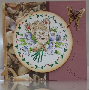
There are mostly Christmas accessories and paper laying about on the hobby table at the moment, so it was a little difficult digging out something that would be appropriate for a birthday card. As soon as I spotted the shell patterned paper I knew I had to use it, though. I am a big fan of purple and think the colour makes for some great cards, so it was the natural choice to go with. Together with the shells it got more of a summer than an advent type of feeling, that is also why I chose a pale instead of a dark purple here.
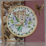
The stamp image was chosen fairly early on and I coloured that before I put the card together. I know it would be a purple themed card, however, so I made sure the flowers also had a purple shade to them. The bear coloured in fairly easy and so did the leaves and border, too. It helps having coloured a stamp previously so you have half an idea what is what and haven’t got to spend time making sure I am in fact colouring in the right bits! I’m actually very pleased how this turned out, except for the choice of a red for the ears and tulip border. The image was edged with tea stain distress ink.
I cut the shell themed paper so it would cover half the front of the card and separated it from the background colour with a darker purple. Some ribbon from a box of chocolates came in handy for the side as the colour was perfect. At the end I added a 3D type butterfly on the top right and drew some lines below.
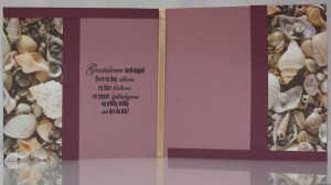
Inside the card I stuck with the shell paper as it’s very decorative on its own. I simply bordered it in with a darker purple and made the two pages look like a flipped mirror of each other, which I think made for a cool effect. The ribbon on the front was tired around the card and not clued on, so it made a nice border inside the card as well. A stamped greeting was added to the left page and the greeting itself was later written onto the right side. I really love how this one turned out and reckon I shall be making quite a few with a similar design!
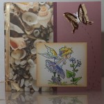
For the front of the second card I used a stamp I’ve been dying to use for quite some time. A Lili of the Valley stamp of fairy smelling flowers. I love it. I had great fun colouring it in and I love how it turned out. There will definitely be many more cards featuring this very stamp image! The butterfly on this card was a little smaller than on the previous to compensate for the smaller stamped image.
I was really very pleased with how the first one turned out inside. I think it’s one of the best ones I’ve made so far. This is why the inside of the second card is identical to the first one and there is no photo of it. I do love how these two cards turned out and I think they may be my best ones yet.


