Merry Christmas, everyone. As the season requires, I’ve been very busy. Thankfully I’ve managed to finish all my christmas cards in time, as well as two birthday cards. I plan to have all of these posted before the year is over. This post here will contain the pair of cards I made as a break from studying for my exams. A most welcomed break it was.
It has been a while since I made a red christmas card now, so I thought I would return to that colour. It is the christmas colour after all. However, as soon as I started going through the patterned paper I spotted a yellow one I wanted to use, and then I came across a striped one I also quite liked. A green one. Then I was sat with red, yellow and green papers in front of me, wondering if it was at all possible to combine the three…
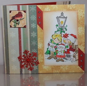
After a lot of consideration I decided that I would try to combine the three. The green was going to get to remain striped on the side and I split the yellow into two corners, so the red would show up between them. So far I have only used this gorgeous Sarah Kay stamp by Stampavie once, which is a shame as it is hopelessly adorable! I figured it would be easier to colour it now that I’ve purchased a middle shade red copic, as well as a pale shadowy blue. Both pens were helped make the result better than when I last coloured this, I think.
Lastly I grabbed two packets of decorations I’ve not found use for so far, which is a shame as they’re both lovely. I added the poinsettia in the top left corner, and the red sparkly snowflake further down. At the very end I added some pearls to break up the red a little.
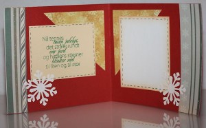
It was difficult trying to keep the same patterned paper inside, as outside. The yellow was easy enough, per se, but I decided using both corners was simply too much. That is why I decided on a top one only. Also, the patterned paper looks slightly different from the one on the front as the various stripes as they go along look a bit different. I don’t think that mattered though. The greeting was stamped on a cream coloured background, as it wasn’t as bright as the white. For the greeting area I still used white, though, as it is easier to write on, but I distressed and bordered it so it wouldn’t be as hard and contrasting. Lastly I added a couple of white snowflakes. The greeting stamp is from North Star Stamps.
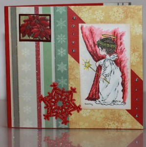
The second one was made to look much like the first one, as I quite liked how the combination of all those various colours turned out in the end. For the stamped image, I went with a Lili of the Valley design. Being afraid too many colours on this would simply kill the card, I did my best sticking to the colours of the patterned papers: red, green and yellow. I also used a lot more distress ink than I normally do, as I wanted the effect much further into the card so it wouldn’t look so white.
The inside of the second one looks identical to the one above, so I’ve not added a photo of it.


