It is such a beautiful day today. All the various colours of autumn being highlighted by the sunshine and bright blue sky. A perfect day for a walk in the forest or around the lake. I have yet to decide which it will be!
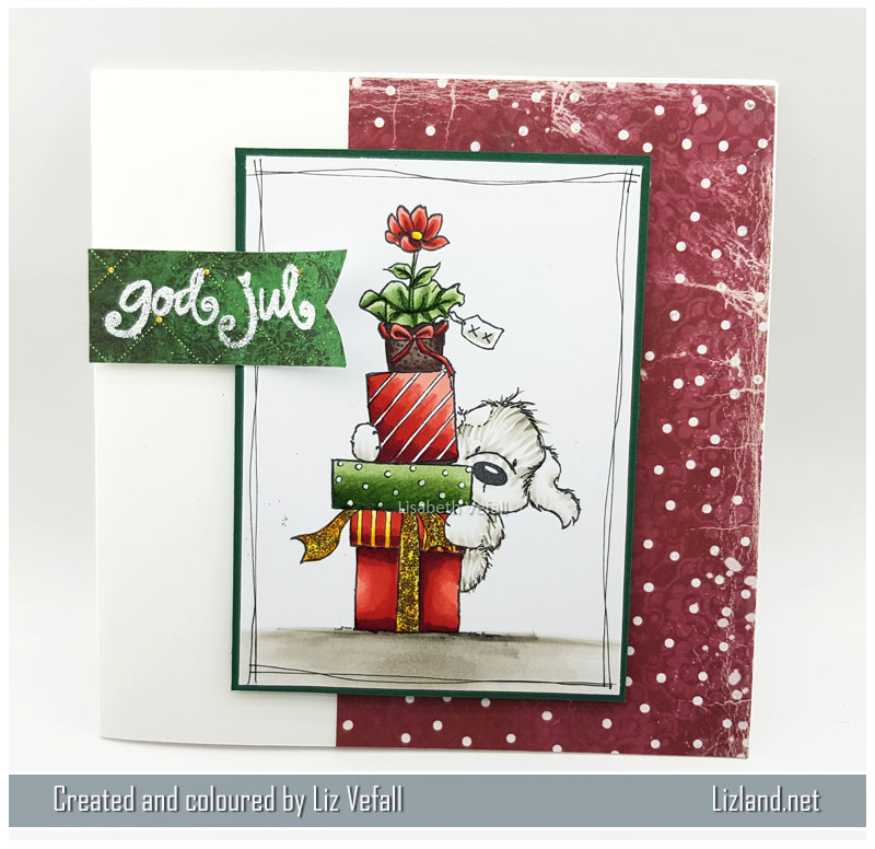
Today I am showcasing a card using Mo Manning’s Best of the Bunch. It is totally adorable and I am certain it will appear on the blog more than once! I had a lot of fun colouring it up and I am quite pleased how it turned out. I’ve used paper from Papermania, flowers from Wild Orchid Crafts and dies from Precious Marieke and Papirdesign.

 The dog was coloured mostly using flicks and then some harder shadows on his belly, bum and on his face. The lighter the colour, the longer flicks I made, and did this both on the brown and grey parts of the fur. I kept most of it white as I wanted contrasts.
On the bench I’ve added a lot of smaller dots. This is to make it look like a stone bench. The dots were all random, but I tried to keep them situated somewhat like the original image even if I added a lot more of it. The majority of the darker dots are close to the edge and on the darker solid colour. Then the lighter dots are on the lighter colour. Again I tried to keep a lot of contrast.
The ground has also been made with many dots, although these are smaller than the bench to make it look like gravel.
Finally a tip: always colour the colour red as the last colour of your project. I find that red will easily bleed into other colours if I colour red first and get another, lighter, colour close to the red. It is terribly frustrating when you are pleased with your image and just added the final few bits and you get close to the red and want to just pull your hair out and never colour again… If you just use the red markers at the end of your project, you can usually avoid such unfortunate mishaps!
Here is, as usual, a different view of the card. You can see both the bench and the gravel quite well on this.

Copics used: (skin) E000, E00, E04, E11, (hair) E25, E27, E31, E34, E49, (bench) W2, W3, W5, W7, W9, (gravel) C3, C5, C7, C9, (red) R22, R24, R27, R29, R59, (outfit) E41, E43, E44, E47, E49, (leaves) YG03, YG67, (simple blue background) B000