I was so very lucky and was chosen as the winner of the guest designer spot after the May challenge at Ching-Chou Kuik’s challenge blog! So here is my card for the July Challenge of Sparkles and Shine! I am not very good at using glitter and such, so it was quite the challenge! Thank you for having me!

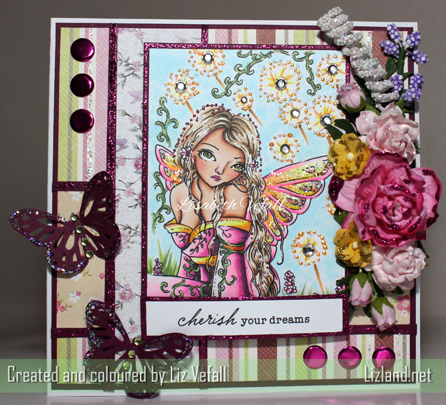
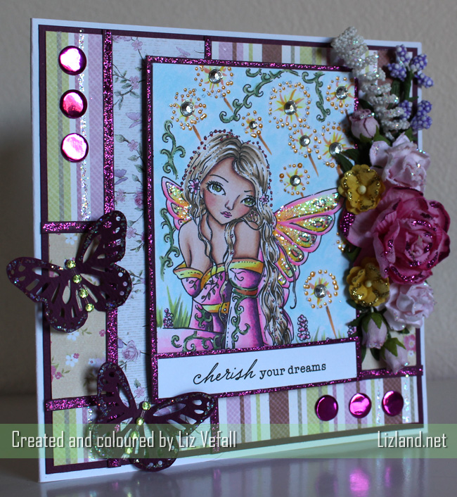
The image I chose is Dandelion Dream, by Ching-Chou Kuik, obviously. I absolutely love these images and it was hard to choose something that I thought might be good with the theme. Everything is coloured with copics. I’ve added lots of pink and yellow dots with liquid pearls for extra shine (which is hard to capture in a photo) and used silver rhinestones as the centre of the dandelions.
All the flowers are by Wild Orchid Craft, apart from the purple berry looking thing which is by Live and Love Crafts. I’ve used a ton of glitter glue and papers from First Edition Papers, Lili of the Valley and Papirdesign. The sentiment is by Pink Pettycoat and the butterflies from a Martha Stewart puncher. Lastly, the shiny pink circles are candi from Craftwork Cards.
I am terrible at trying to take photos of something shiny or sparkly, therefore I have taken quite a few, with different light sources, and instead of just picking one I’ve decided to share four of the photos. I think it’s a good example to show how different light sources can make the photo look different as well.
This first one shows the colours best, but a bit heavy in contrast. Daylight and flash.
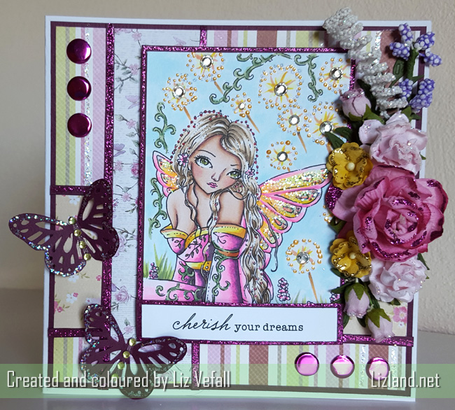
The second photo shows the sparkles a bit better, but the colours are also duller. I used the camera on my phone for this.
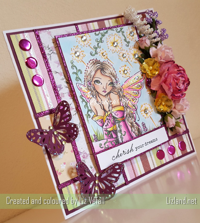
This photo is truer to the colour of the card, but it doesn’t show the sparkles and shine as good as the other photos. Lightbulbs and flash.
And lastly, here is a darker photo to show off the sparkles even better! Daylight, no flash.
Copics used: (hair) E51, E53, E43, E44, (skin) E000, E00, E04, E11, E21, (dress and wings) V99, RV00, RV02, RV04, Y04, Y08, YR02, (greens) YG03, YG97, G94.