Well, the plan to post several of the cards I’ve made didn’t go very well, did it?
When I posted, three weeks ago, things were slowing down and I was going to have more time to study – which meant I could try to update the blog more often also. As you might have guessed, that didn’t happen and I got even busier than I had been. It hasn’t all been ‘bad busy’ though, I’ve also had a week holiday! Despite being busier than ever, I have managed to make quite a few Christmas cards the past few weeks, so I am aiming to get them up over the course of the next month. Posting here had to be down prioritised, however…
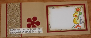
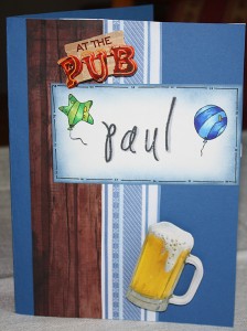
This card was made in early October, for my cousin’s 40th birthday. I was quite excited to finally make a card for my side of the family, instead of my boyfriend’s half! My cousin appears to like earthly colours and that is what I decided to go with here. As you may have guessed from the older posts, I am quite fond of the sandy brown together with darker shades of red. The punched flowers also had to make its appearance! Apart from that I added a nice sandy looking paper and had much fun matching in the colours of the stamp. The stamp is called Louis with flowers and is by Wild Rose Studio.
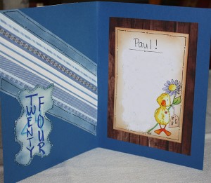
The middle was equally easy to make. The duck stamp had to be used as it was a nice subtle way of added the dreaded four-nil number. Apart from that I stuck with the theme and colours from the front. The Norwegian written on there translates to ‘the older you get, the more your cake looks like a torch parade’. It is something my cousin would find quite funny.
I do like this card and feel I am progressing and making better ones each time which is a great motivator.


