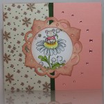
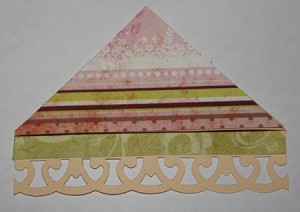
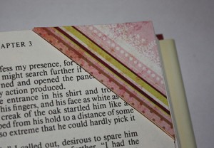
About half a year ago I made some bookmarks (see the old post here). I made them after I’d found a tutorial which was very simple to use. While making a birthday card for a young lad, I decided to make some matching bookmarks, as he is always happy getting books for Christmas and birthday presents. I decided to try to make the bookmarks from memory, and they turned out surprisingly well as I didn’t use any dimensions or a blank template.
Tag: pink
Pink with a hint of summer
I had to make another birthday card before Christmas as well. It was for a lady celebrating her 50th birthday, so I wanted to make a handmade card for her as I feel they are so much nicer to get, especially on a special occasion like that. As it was only a couple of days until Christmas I didn’t sit forever pondering what to do, I simply decided to follow the theme from the birthday card I’d made the night before.
Feel better
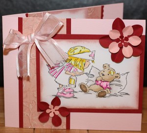
When my boyfriend’s little cousin broke her arm, it was a perfect time for me to make my first get well card. I had already spotted the perfect stamp image, which is a Lili of the Valley design, called Little Nurse. The challenge here was that we ordered the stamp sent to my boyfriend and I had to make the rest of the card before getting the stamp image. It was a fun challenge, actually.
As she is a very girly girl, the main colour had to be pink. The colour I decided to use with it was red. A somewhat brave colour choice, perhaps, but it turned out better than I feared it might when I started.
Occasionally struggling due to the lack of stamp image, I eventually ended up making two flowers with the same colours as the card, and a pink bow. As it was the first time I tried to create a bow, I struggled somewhat getting it to look as I wanted. The end result was thankfully not dreadful. Once I got a hold of the stamp image I coloured it with somewhat matching colours (I only brought a handful of pens) and clued the remaining bits together.
The middle part was of course easier as I didn’t have any missing elements for it. The patterned paper I used had a slight shimmer to it, so it did the job mostly on its own. I decided a red border would make a nice frame. The pink distress ink I’ve got was a really good match, also.
I had fun making this and like the end result; and more importantly, so did the little girl!
Smell the flowers
Time sure does fly at this time of year. The card in this post was made at the start of the month and I have only just now had time to write this post. There are a few more card posts to follow next weeks also.
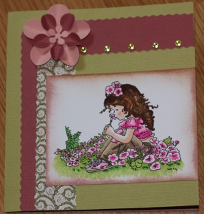
I had many flowers made up using the floral punches, so I wanted to make a card where I could use one. To keep with the flowery theme, I wanted to use a floral stamp as well. The obvious choice of stamp was the girl sat in a bed of flowers. It is a Sarah Kay stamp by Stampavie. As this is a stamp I’d recently coloured for a different card, I wanted to make this look different. The previous one was very colourful, so this time I tried to stick to only a few colour palettes. I’m very pleased with the result.
Additionally I wanted the card to be fairly plain and leave the stamp as the main design element. The greens and pinks were then obvious colour choices.
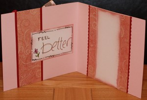
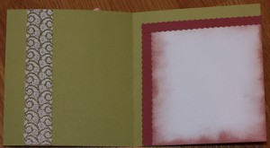
I reused some of the elements from the front and decorated the inside like this:
Bookmark – corner
I wanted to make a bookmark to go with a card I made for my other half’s lil cousin who recently broke her arm. If it had been me breaking my arm as a kid I’d have been reading, anyway. Besides, one can never have too many books or bookmarks! Right?
So I went to my mates at Google and wondered if they had any good inspirational bookmarks for me. And boy did I find a good one. I knew the second I saw it that I had found what I was looking for. Wee monsters for munching your pages! They are so adorable! Have a look here for the brilliant tutorial I found!
However, my first attempt didn’t turn out like a proper monster, as I’ve yet to figure out a good way to do the eyes properly. My circle cutter doesn’t make circles small enough. So while I ponder how to do the eyes on the monstermarks, here is my ‘normal’ corner bookmark. This is the front:
This is how the back looks:
Here you can see how it looks on a page:
I love it! It sits really nice on the corner of the page and is not sticking out to get in the way. I’m going to make several for myself.

